Case study
All workBeCrystal
Turning scattered financial data into one clear, investor-ready model for B2B SaaS companies.
All screens in this case study use dummy data.
- Role
- UI/UX Designer
- Year
- 2025–2026
- Company
- beCrystal
Overview
01 06
beCrystal connects to the systems where a company's revenue is recorded — accounting, billing, CRM — and brings all of it into one financial model. The AI does the work of putting it together; a person steps in where it can't. But the hard part was never the number itself. It's that whoever reads it has to be able to stand behind it in a room — which means knowing where it came from, what shaped it, and how far down they can follow it.
- Role
- UX/UI Designer — the only UX/UI designer on the team
- I owned
- Prototyping and feature-level testing with pilot customers, interaction and UI design across the product, the design iterations that followed from feedback, and the component library the product was built from.
- I worked with
- CEO, CTO, backend and frontend developers
- Tools
- Figma, FigJam, Linear, and Claude to build throwaway prototypes before spending engineering time on an idea
- Duration
- 1 year 3 months
- Starting point
- A dashboard existed when I joined. Everything else I designed around it: the product's object model and the way you move through it — the four core entities, their detail views, drill-down, side panels, global search and data tables — plus the data quality layer, integrations and notifications. The dashboard itself got reworked along the way.
What I was designing for
02 06
Problem
beCrystal is built for scaling B2B SaaS companies — the stage where revenue is recorded in several systems at once, each telling a slightly different story, and reconciling them is still nobody's job.
So before any decision gets made, someone first has to put together a number they can rely on. That's the real work. And the people doing it aren't asking for analytics — they're asking to say a number out loud, in a room where someone will check it.
What people needed
"I need to know how this number was calculated and whether the data behind it is fresh and clean, before I use it anywhere."
"I want to see when the data was last updated, so I'm not presenting something a week old without realising it."
"When something is wrong with the data behind a figure, I want the product to tell me what's wrong and where to go — not quietly show me a number that's off."
"I want to spot the numbers that need my attention at a glance, without the screen shouting at me about everything at once."
"When a total looks off, I want to open it and see the customers, products and invoices making it up — without losing what I was comparing it against."
"I want to see what's driving the headline figures: which customers are the biggest, which products earn the most, where churn and upsell are happening."
"I want to see what's driving the headline figures: which customers are the biggest, which products earn the most, where churn and upsell are happening."
"When the system gets something wrong, like the same customer recorded twice, I want to fix it myself and see the numbers correct."
"When my colleague and I open the same screen, I want to be able to tell at a glance whether we're seeing the same thing."
What made this hard
For a long stretch, there was no user base to research.
Signal came in pieces: a handful of pilot customers, whatever we picked up from demos with prospects, and later the data real customers brought with them. None of it was a sample, and none of it arrived on a schedule. Every insight had to be assembled from a small number of long conversations and from whatever the next account happened to reveal.
We weren't improving something. We were deciding what it was.
Most of the product didn't exist yet, so there was no broken flow to fix — the question was what the flow should be. Those calls were made together: direction with the CEO and CTO, feasibility with the engineers, and priority against what pilot customers needed next.
Every customer's data is shaped differently.
Different accounting tools, different billing logic, different naming. And each new customer arrived with a case we hadn't anticipated, so the MVP kept having to stretch to hold it — designing for the shapes we knew while leaving room for the ones we hadn't met yet.
What I built
03 06
The dashboard, before and after
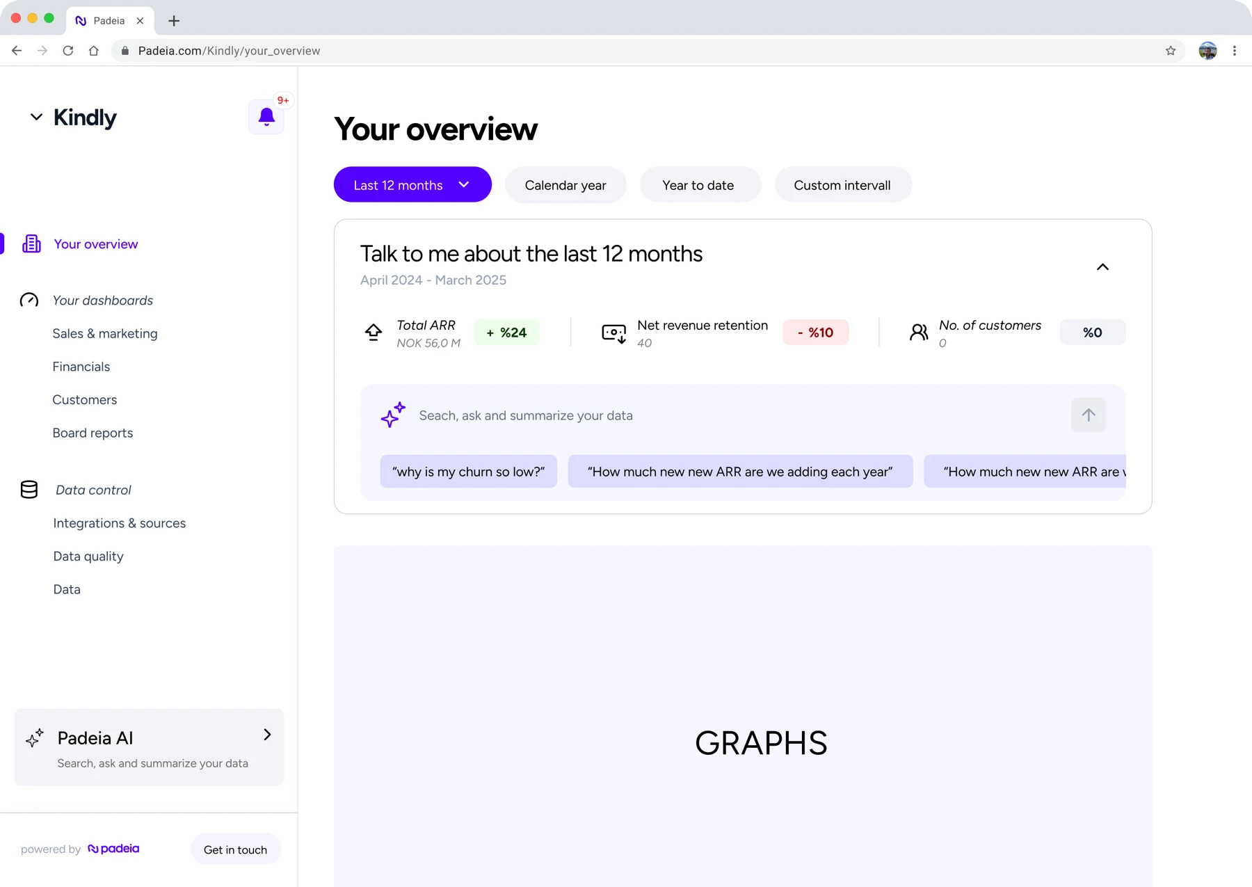
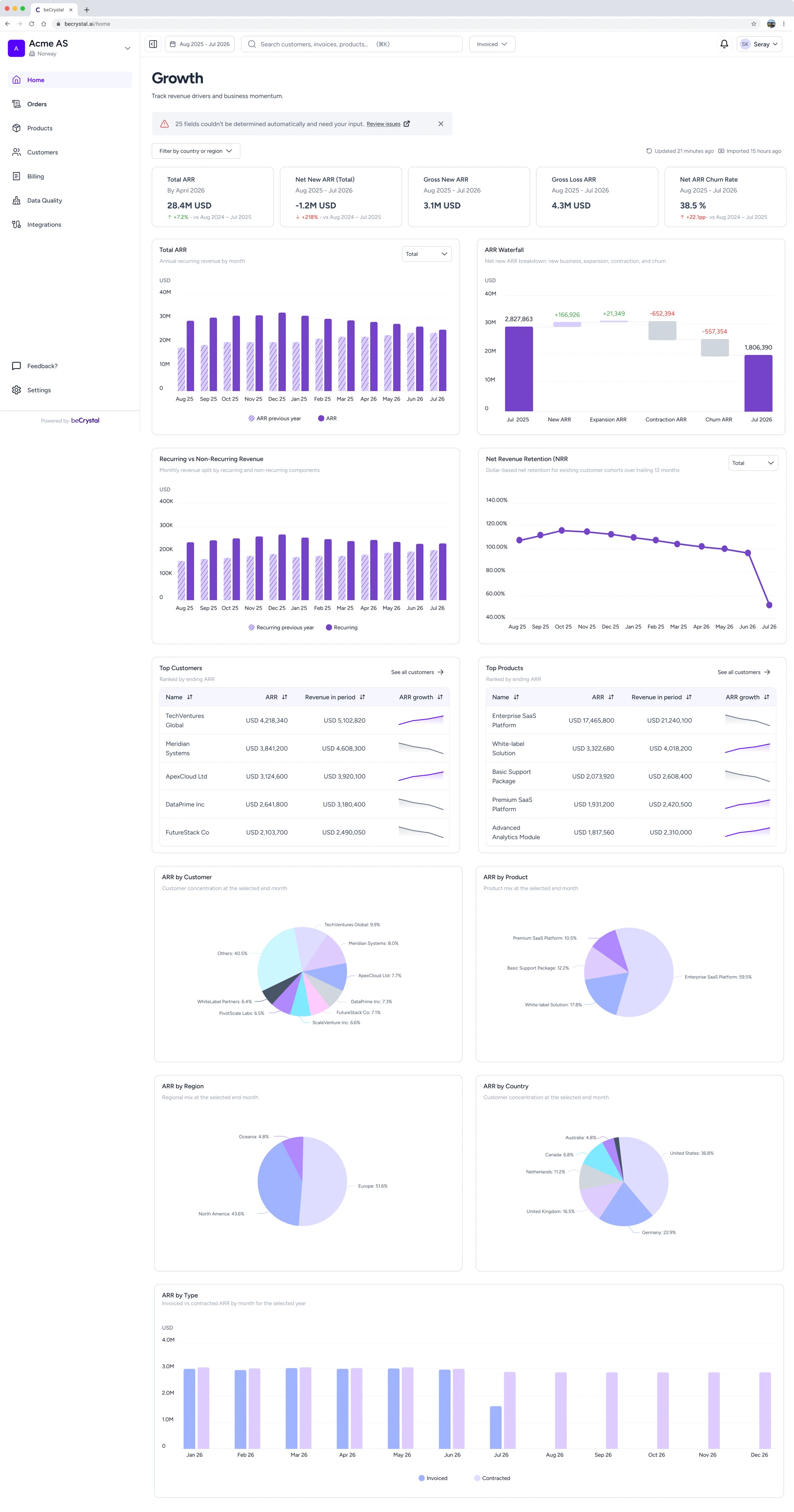
A draft of a dashboard existed when I joined. The pieces were there, but not in a shape that met what people actually needed from it. Rebuilding it around those user needs set the pattern for the rest of the product, so it's the clearest place to start — everything below is what changed and why.
Before
“Which period are we looking at?”
One period, selected once and held across the whole product — including inside side panels, so following a number into its detail never quietly changes what you're comparing against. Two people on the same screen now see the same thing by construction. This is the change behind the two readings at the top of this page.
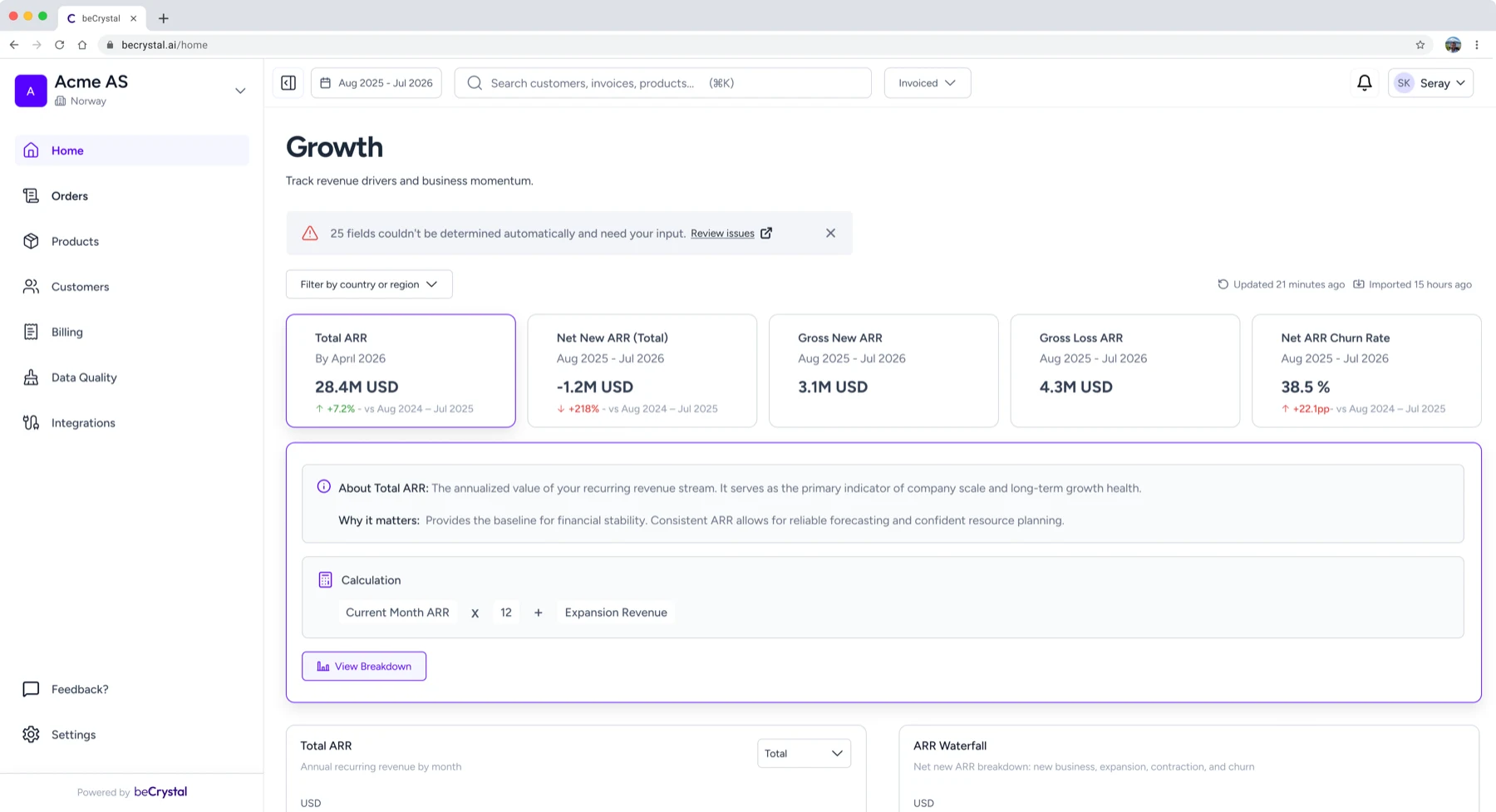
“How current is this — and is anything wrong with it?”
The data carries its own age: timestamps show when it was last updated, so nobody has to ask and nobody has to assume. And when the underlying data has problems, a banner says what's wrong and points at what to do about it, rather than letting a quietly incorrect figure stand.
“Where does this number come from?”
Each KPI card opens to show why the metric matters and how this instance of it was calculated. Keeping the explanation attached to the specific number on screen — rather than to the metric in the abstract — changed how people felt about the figure, not only how much they understood it: seeing the calculation made them trust the result.
Numbers that need attention are marked with colour — loud enough to find, quiet enough to read past.
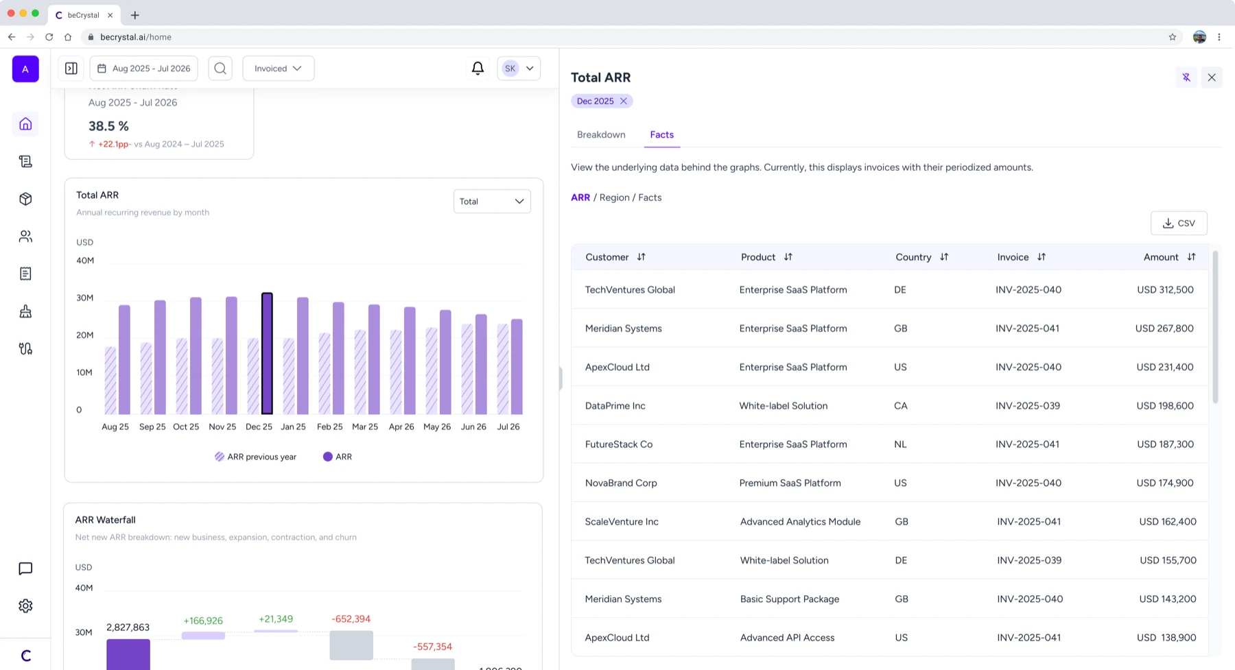
“Show me the movement, not just the total.”
Below the headline figures, tables and charts break the numbers into what's driving them — which customers, which products, what changed over the period.
Moving through the product
Every figure opens into the records behind it — and the way there had to protect whatever the person was doing when the question came up.
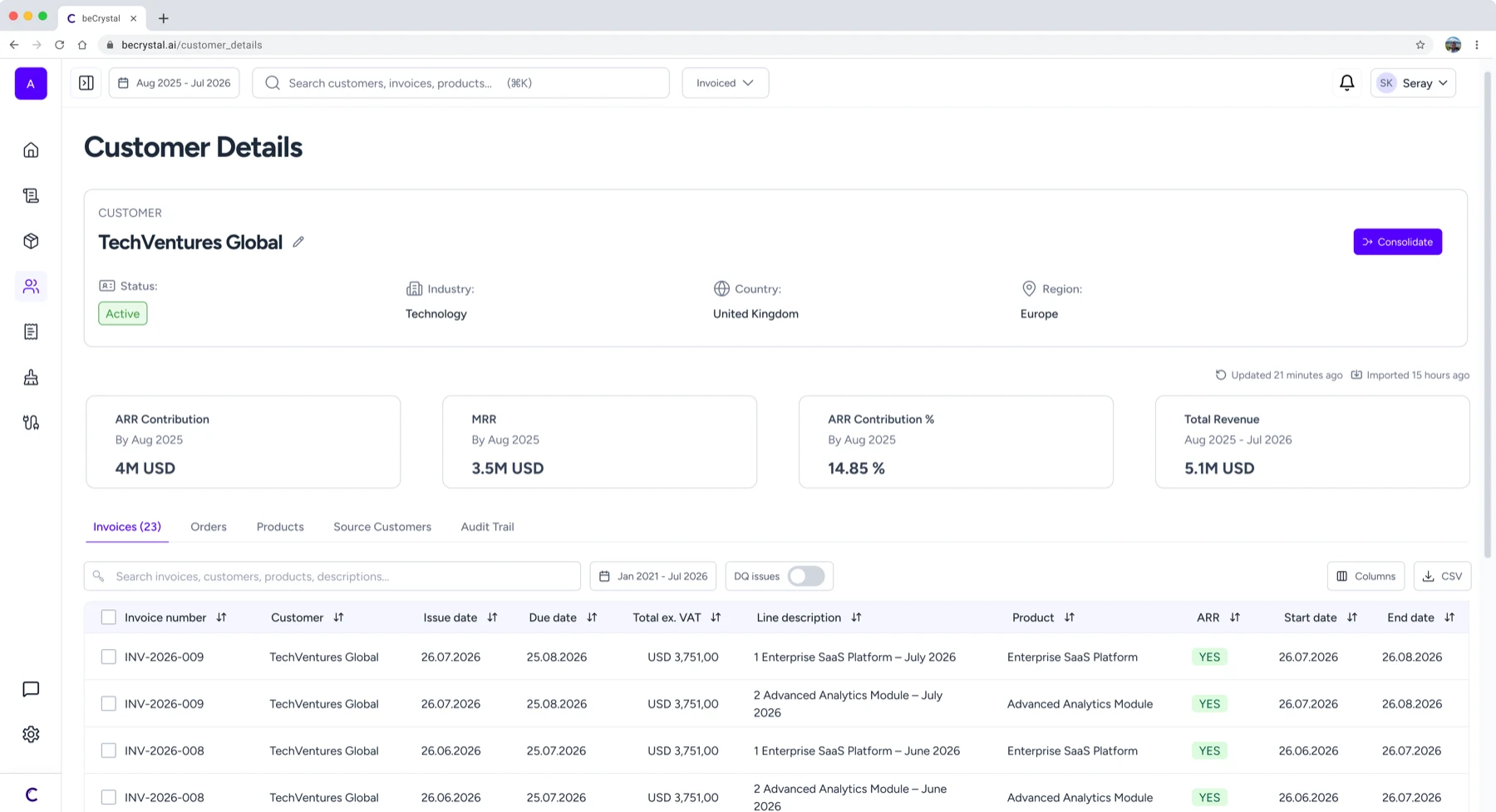
“Let me see what's behind it.”
When a user wants to understand a single customer, product, invoice or order, they get one page with everything attached to it — what it's worth, what's connected to it, and where it came from. No jumping between screens to piece it together, and no question left that sends them back to the source systems.
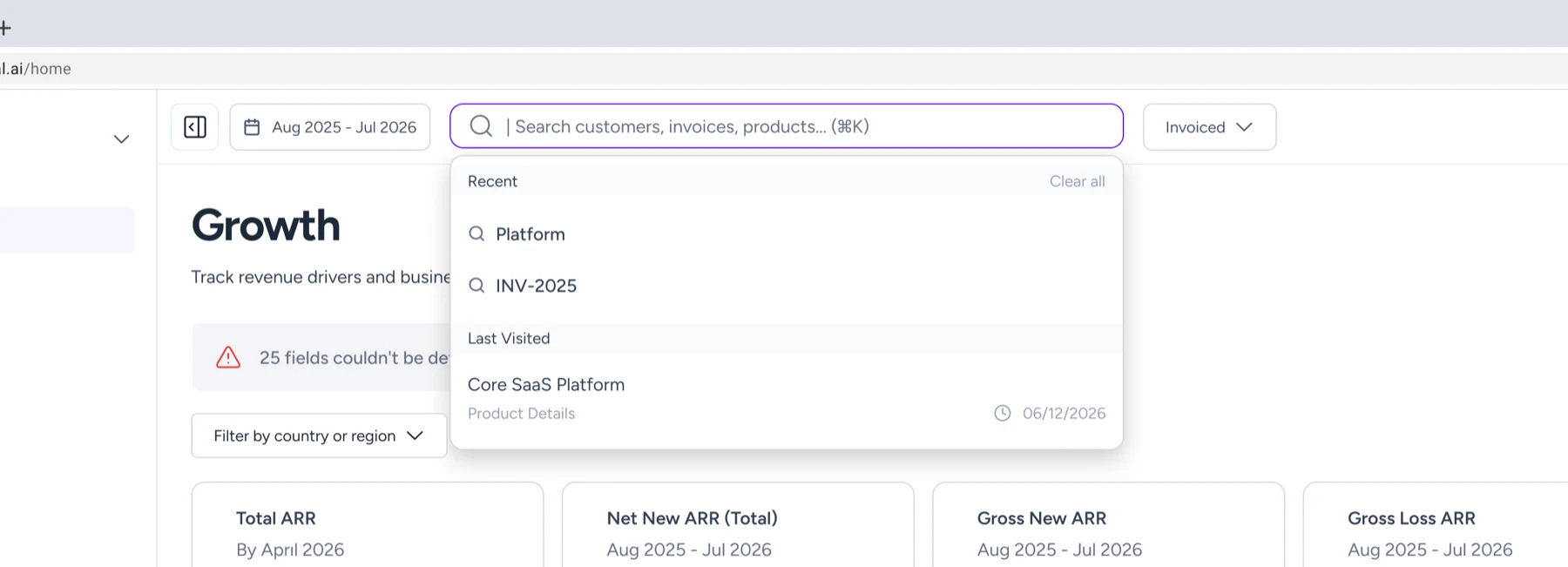
“Take me straight to it.”
Global search reaches any customer, product, invoice or order directly, without working out which list it lives in first. Recent searches sit right there, so getting back to something is quick.
Fixing the data
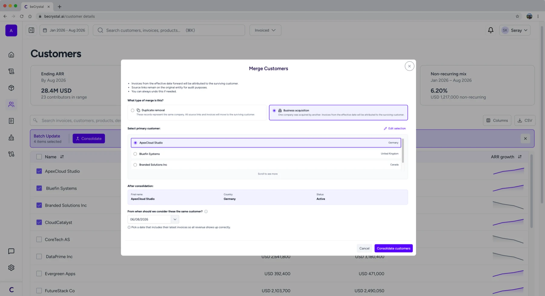
“Let me fix what's wrong.”
The system unifies what it can; the last calls are judgement. When the same customer or product has been recorded twice, the user can merge them and see the numbers correct — fixing the data is a normal part of using the product, not an admission that it failed.
Keeping it consistent
The library behind the product was small; the discipline around it wasn't. Buttons, icons and the recurring components existed once and were reused everywhere, nothing redefined from one screen to the next. New screens started from components and rules that already existed, so consistency wasn't something to check at the end — it was the starting condition.
How we worked
04 06
Prototype sessions with pilot customers
and with users who matched the same profile. Testing on the prototype rather than describing the idea — the disagreements showed up faster that way.
Design reviews with the CEO, CTO and engineers
on a regular rhythm. Most of what shipped was shaped in these, not in Figma alone.
Throwaway prototypes built with Claude
when an idea needed to be argued about rather than described. Cheap enough to discard, real enough to test — no engineering time spent on something we'd drop.
Handoff through Figma and Linear
Design Process
05 06
Data Quality Took Three Passes
Data quality is where the product surfaces what it couldn't work out on its own. The goal is to achieve the most accurate calculations and the most accurate numbers by accessing clean data. It is the product's whole promise, so we built for it early — with the assumptions we had and the customer data we could see at the time. The model was straightforward: the system finds what it can't resolve, lists it, and a person works through the list.
Three passes later, it works differently. Each version shipped, held for a while, and then broke against data we hadn't seen yet.
First Pass — Fix it where you find it
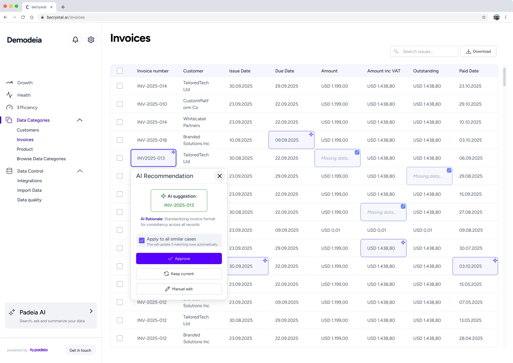
The first design put the fix where the problem appeared: in the entity tables. A user sees a row with something wrong in it and resolves it there, one at a time, without going anywhere else.
We prototyped it and tested it with a small group of users. It went well — people understood the interaction quickly and needed very little explanation. So it shipped. Then the pilot base grew and we started talking to different kinds of customers. Some of them had hundreds of problem rows.
A design that works on ten rows isn't a slower version of itself at four hundred — it stops being usable at all. The test had told us the interaction was right. It couldn't tell us anything about the volume it would meet.
Secon Pass — Batch operations and one place to see everything
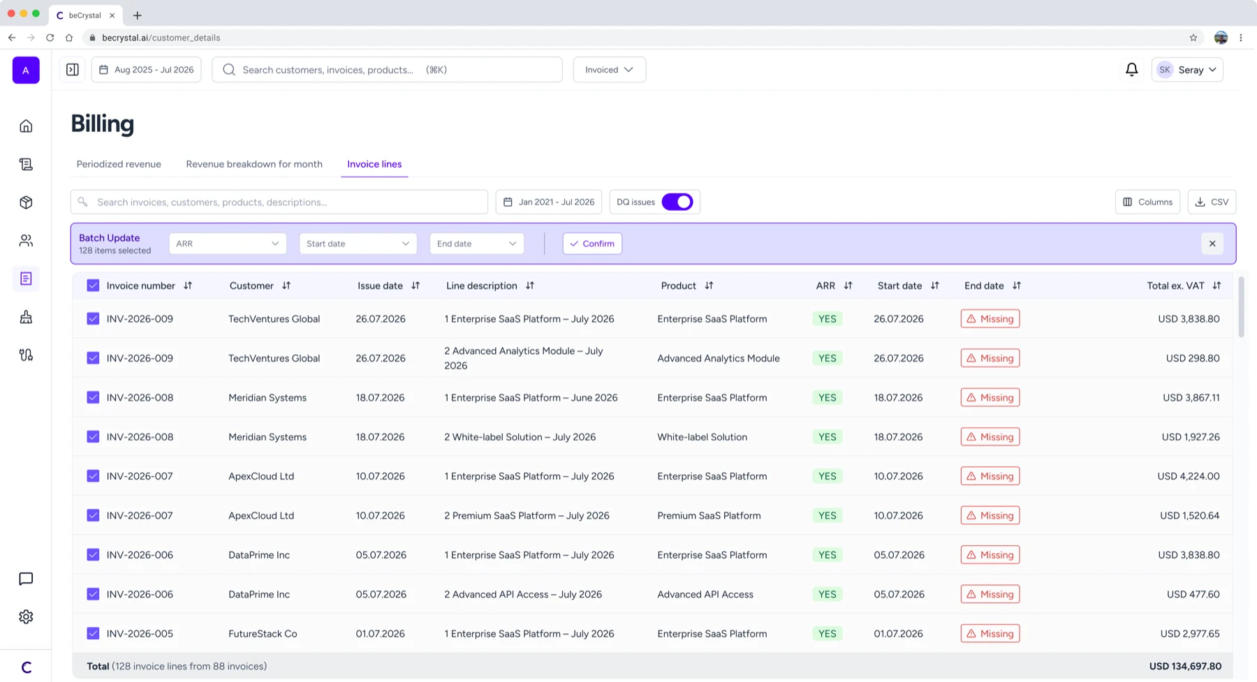
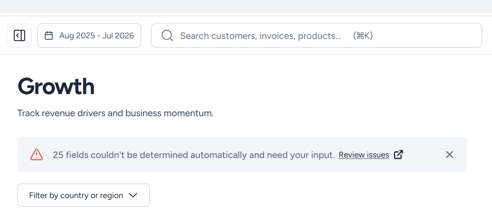
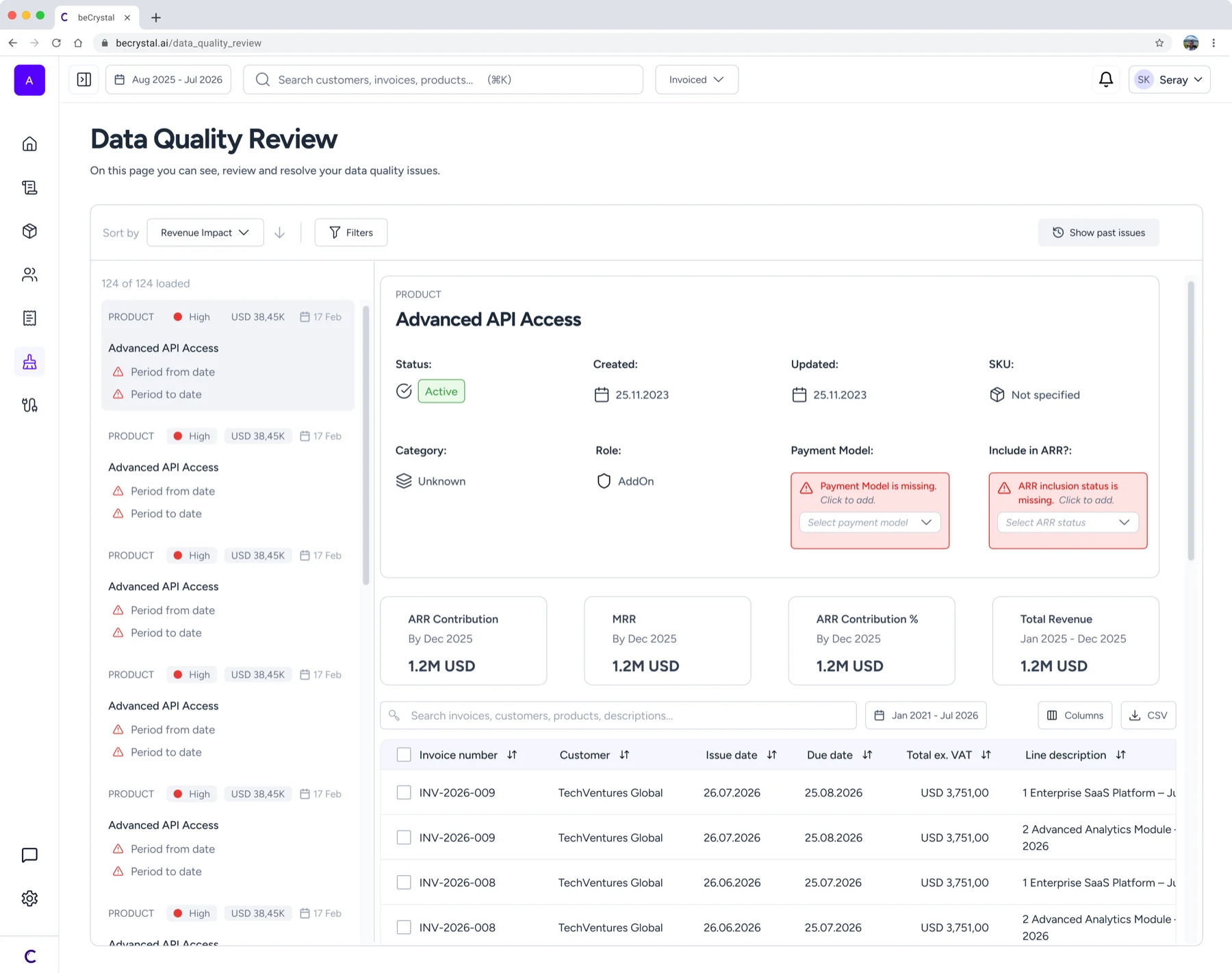
So the second pass let users handle issues of the same kind together instead of one by one. It also added a dedicated data quality screen, where every outstanding issue could be seen in one place, and a banner on the home screen above the KPI cards to send people there — until then, users mostly found out there was a problem by running into it.
This worked, to a degree. Then the customer base grew again and brought cases we hadn't planned for. Issue counts kept climbing, and clearing them to get to a reliable number became more work, not less.
As the product matured and we saw more of what customers were actually dealing with, we started looking at the problem from a different angle. Both designs had worked on their own terms; what changed was our understanding of the unit. We had been designing around the individual issue, and what users were trying to fix was the pattern producing them.
Third pass — the system proposes a rule
(Ongoing work: not built yet — still in ideation, feasibility and prototyping)
The current design starts from the pattern instead of the row. The system reads a company's data, finds what keeps recurring, and proposes a setting that resolves all of it at once — explaining what it found and what the setting would do, so the user can decide whether to accept it. Clearing a queue becomes making a few decisions.
That meant redesigning around the new model rather than adding to the old one:
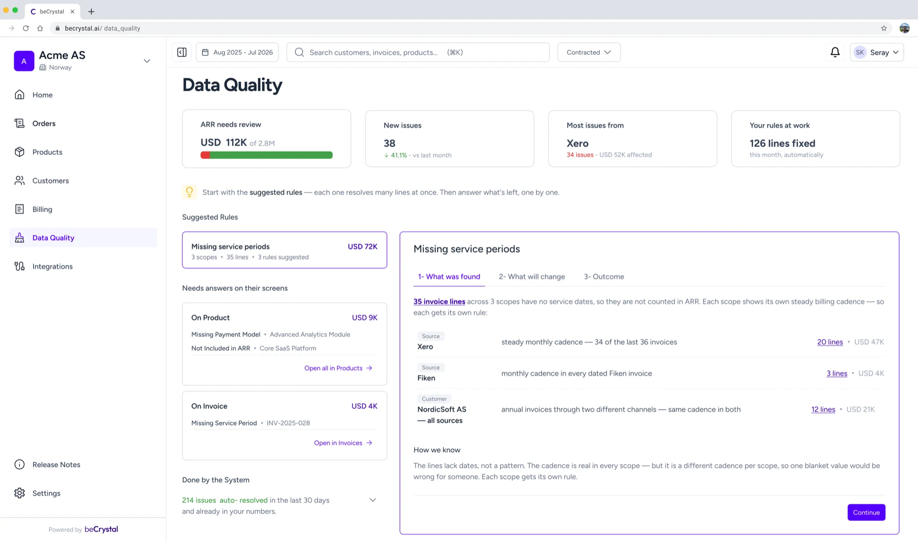
The data quality screen was rebuilt on a master–detail layout
so a user can move between issues without losing the one they were reading. Resolving became a wizard, designed to work anywhere in the product rather than only on this screen.
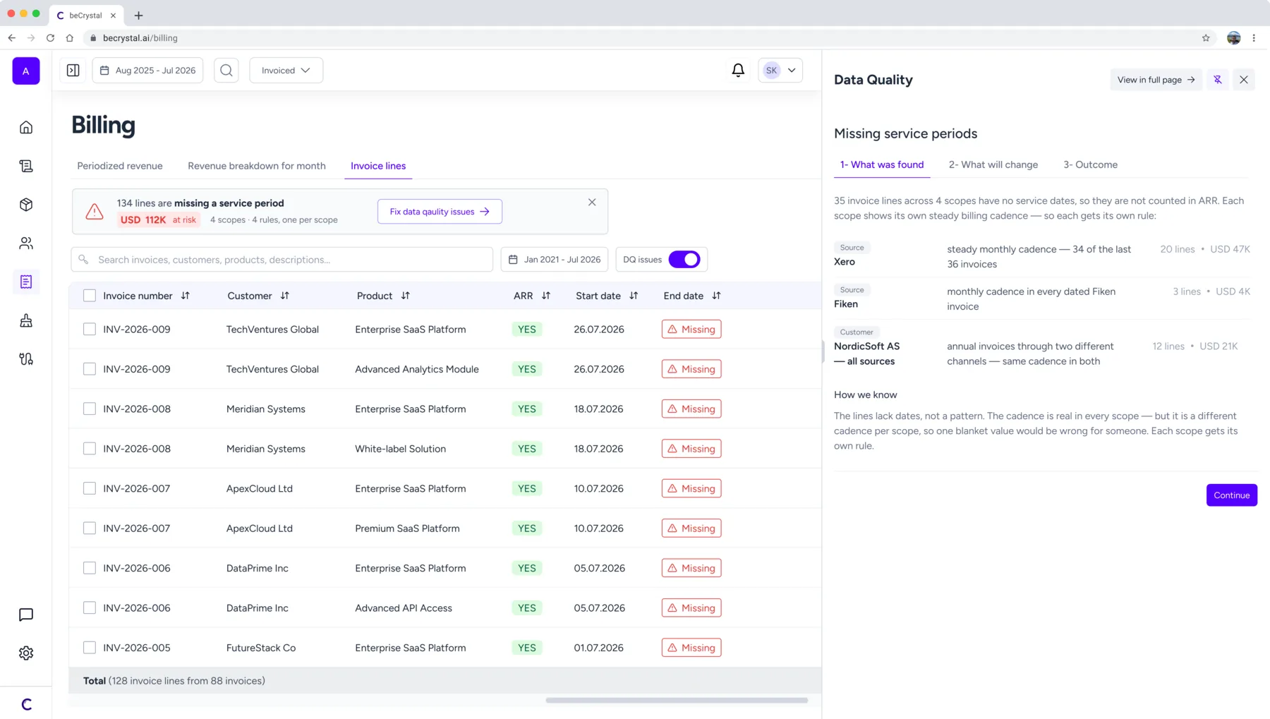
On entity screens, issues stopped depending on a filter
Before, a user only saw problems on products or invoices if they switched a filter on. Now a banner shows them directly — and it reports the amount at risk, what's causing it and how many lines are affected, instead of only how many issues there are.
The wizard opens in a side panel
so the fix happens on the screen where the problem was noticed, with the system's suggestion already in it.
What I'd do differently
06 06
Accessibility from the first component
I learned WCAG properly during this project, which means I know exactly where this product is weak: contrast in the data visualisations, and keyboard navigation through dense tables. In a product read by people under time pressure in a meeting, those aren't edge cases.
Give the foundation dedicated time from day one
The library did its job — it grew alongside the product, shaped by what each screen needed. Next time I'd give it dedicated time at the start instead: rules named, components documented, so the system leads the screens rather than follows them.