Case study
All workChimp
An AI platform that personalises your professional growth — surfacing the right resources, connections and opportunities based on who you are and where you want to go.
- Role
- Intern UI/UX Designer
- Year
- April – July 2024
- Company
- Chimp
Overview
01 05
Chimp is an AI-based professional development and networking platform. It uses advanced AI technology to provide personalised recommendations based on each user's professional goals, skills and interests — serving as a holistic platform for growth and networking, from skill development to industry trends and career opportunities.
I joined Chimp as the sole designer on a team of four, tasked with turning the founder's product vision into a working MVP. This was my first professional design experience. We had four months to build the product from scratch — web and mobile, across five main surfaces.
- Role
- UX/UI Designer (intern) — sole designer on the team
- I owned
- Translating the founder's vision into screens across web and mobile. Researching comparable products and best practices, producing sketches and high-fidelity Figma designs, iterating based on team feedback.
- I worked with
- Founder, technical architect, full-stack developer
- Tools
- Figma, Trello
- Duration
- 4 months
- Platform
- Web and mobile
- Starting point
- A partial design system with base components. Home, Roadmaps, Profile, Connect and Chat were all designed from scratch.
What I was designing for
02 05
Problem
Chimp was built for two types of users: students trying to figure out their direction, and professionals actively working on their growth. Both were trying to bridge the gap between where they were and where they wanted to be — they just didn't always know what that gap looked like.
What people needed
"I know I want to grow, but I don't know where to start or what to focus on."
"I want recommendations that are actually relevant to me — not a generic list of popular courses."
"I need a way to track progress that doesn't feel like another thing to manage."
"I want to find people I can learn from — not just add to a contact list."
"I want to know what's happening in my field without having to go looking for it every day."
What made this hard
No users, no feedback loop.
Every decision was a hypothesis. Research helped — studying how people use LinkedIn, Coursera and similar platforms gave us signals — but there was no way to test assumptions until the product was in front of someone real.
We were inventing the product, not improving one.
The founder came with a vision; I came with a blank canvas. Most core decisions — how AI-generated content should be presented, what a roadmap state should feel like, how to surface personalisation without making it feel algorithmic — were ours to make from scratch.
One designer, many surfaces.
Home, Roadmaps, Profile, Connect, Chat — each was its own challenge, on both web and mobile. Keeping the experience consistent across all of them, with a partial design system and a tight timeline, was its own problem to solve.
What I built
03 05
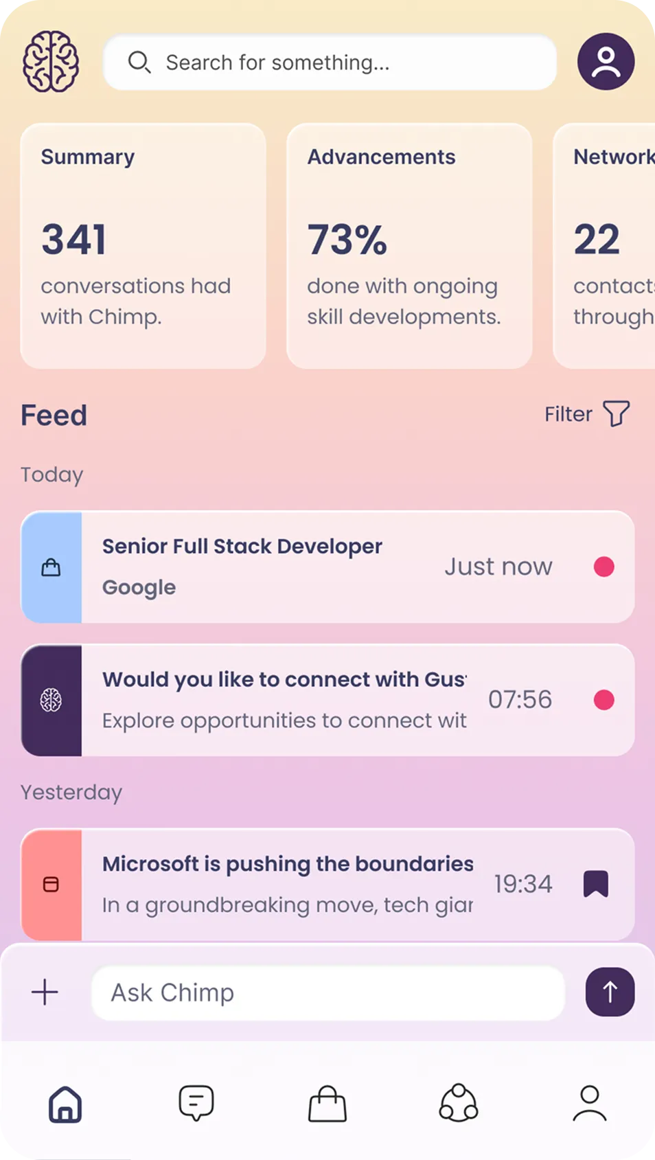
Every feature was designed for both web and mobile. The two platforms share a visual language but not a layout — each version was structured independently to fit how people actually use that screen on that device.
Home
The Home screen is where everything comes together. On the left, a summary of your progress — conversations with Chimp, advancement percentage, networking activity. In the centre, a personalised feed filtered by jobs, courses, contacts, events, news and Chimp-generated content. On the right, the Quickchat panel — the AI is always a question away, regardless of where you are in the product.
Designing this screen meant understanding the hierarchy before touching layout. The feed is the main event; the summary and Quickchat are supporting context. Getting that balance wrong — giving too much weight to either side — would have made the screen feel like a dashboard rather than a starting point.
Profile
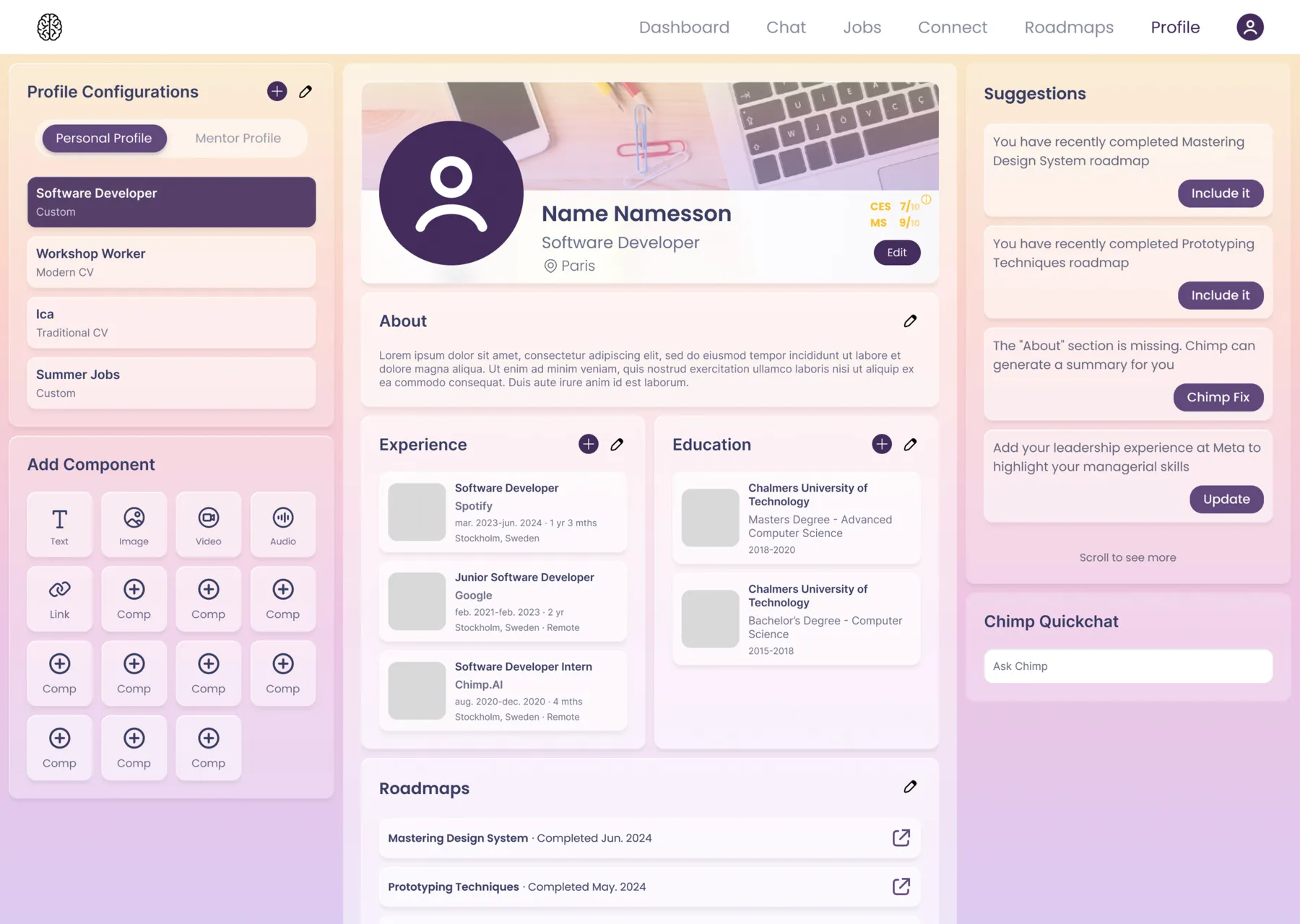
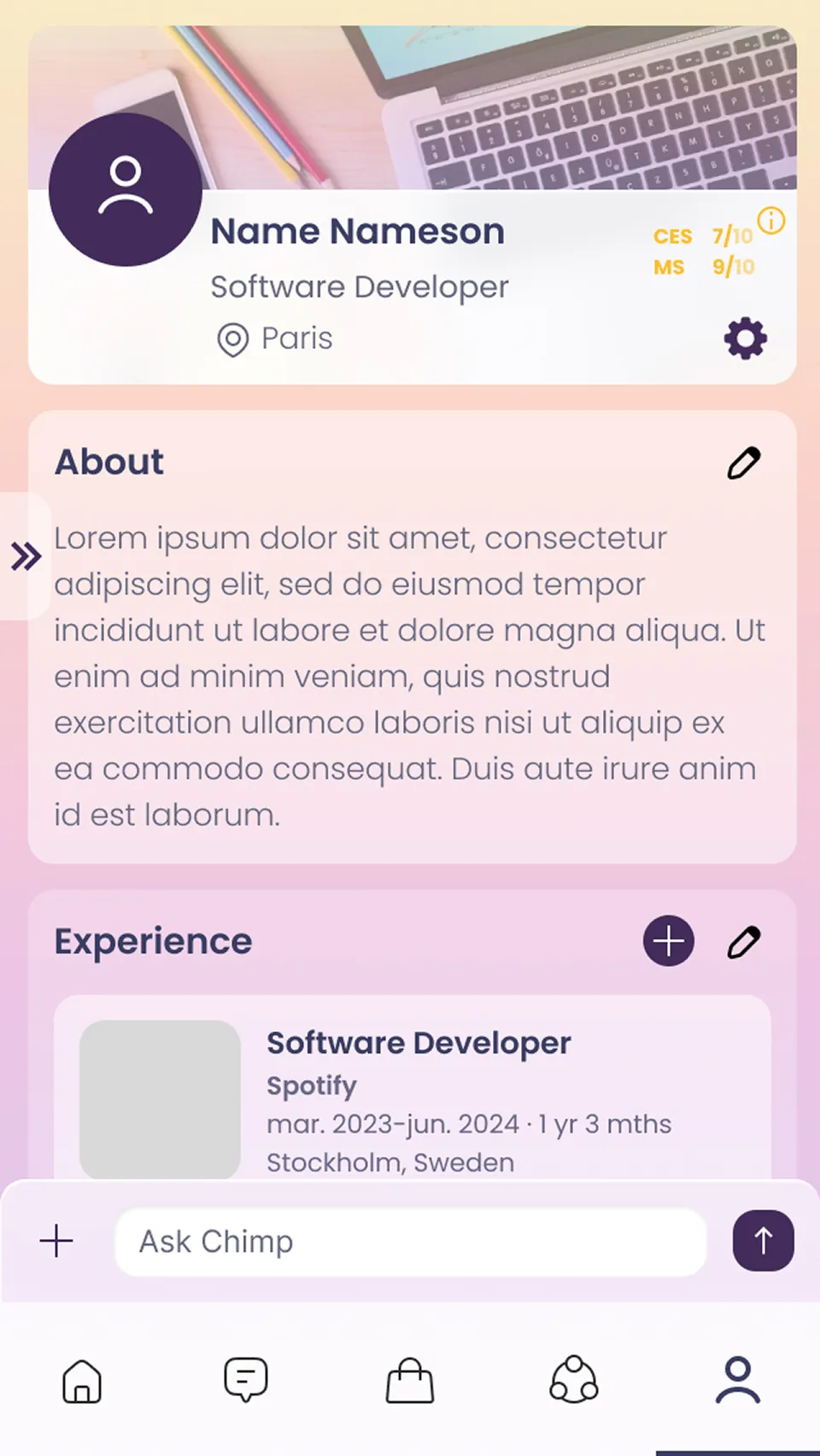
The profile has two jobs. It gives the AI the structured data it needs to personalise your roadmap and feed — goals, skills, experience. And it presents that information to other users: potential mentors, collaborators, employers.
That double job created a real tension. A profile optimised for machine readability is a form. A profile optimised for human readers needs to feel like a person. The challenge was finding a layout that worked for both without feeling like either.
I focused on the CV layout — the most recognisable format for the professional audience Chimp is targeting. When a roadmap is generated based on a profile that looks familiar and complete, users are more likely to trust what comes out the other end. The AI's input fields sit in a secondary section — they matter to the system, but they don't need to dominate the human-facing view.
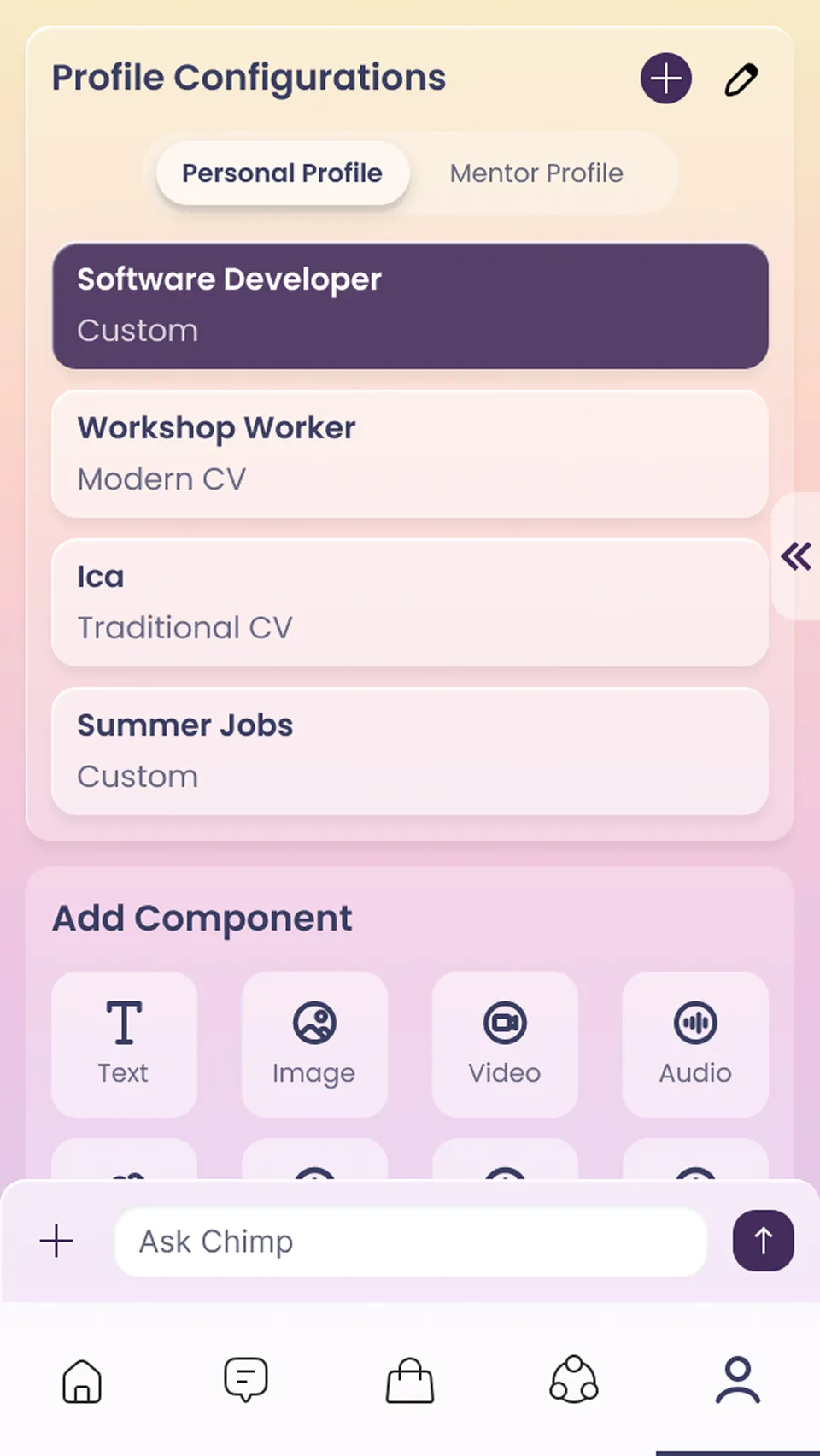
Users can have a personal profile, a mentor profile, or both.
Connect
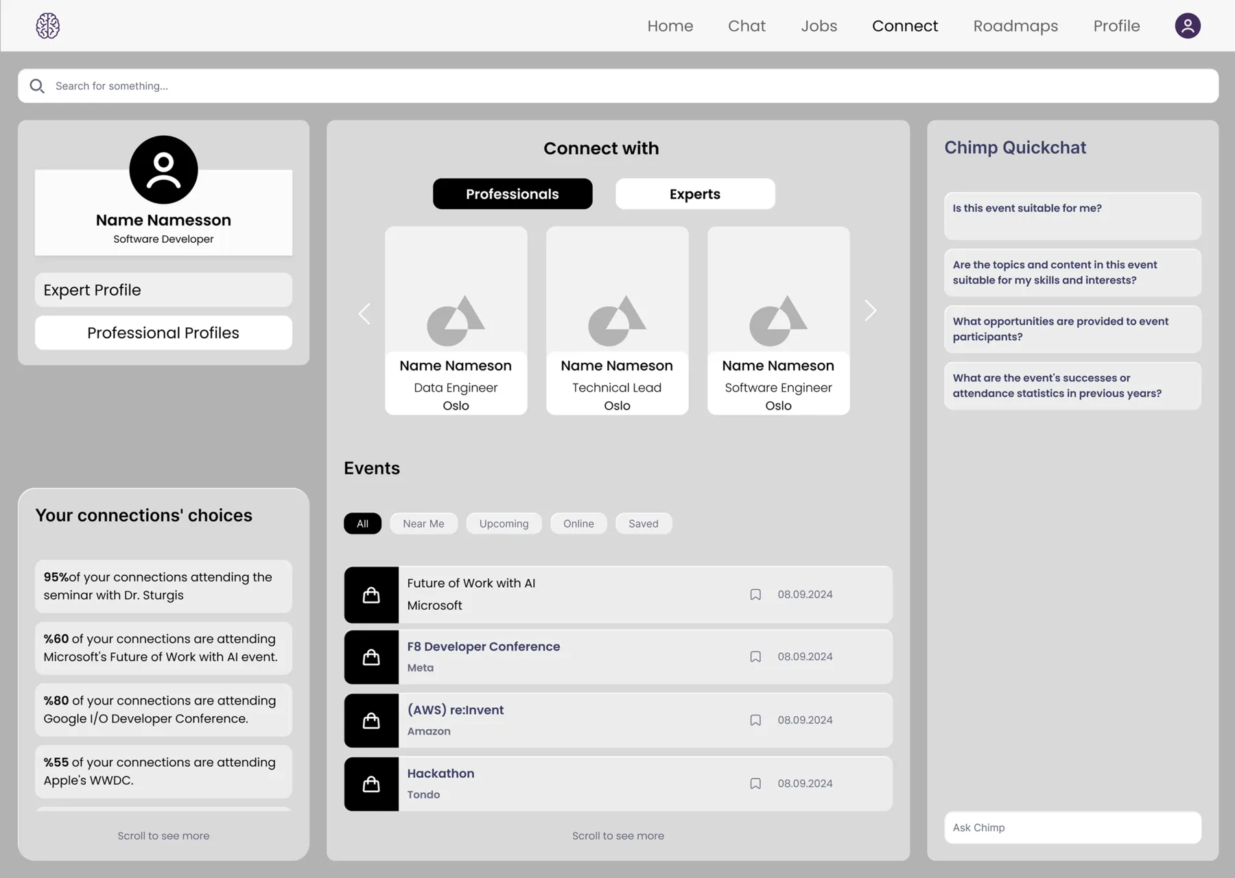
Roadmaps tell you what to learn. Connect is about who to learn alongside. It surfaces people worth knowing — professionals and experts the AI recommends based on your profile — alongside events in your field and what your existing connections are already attending.
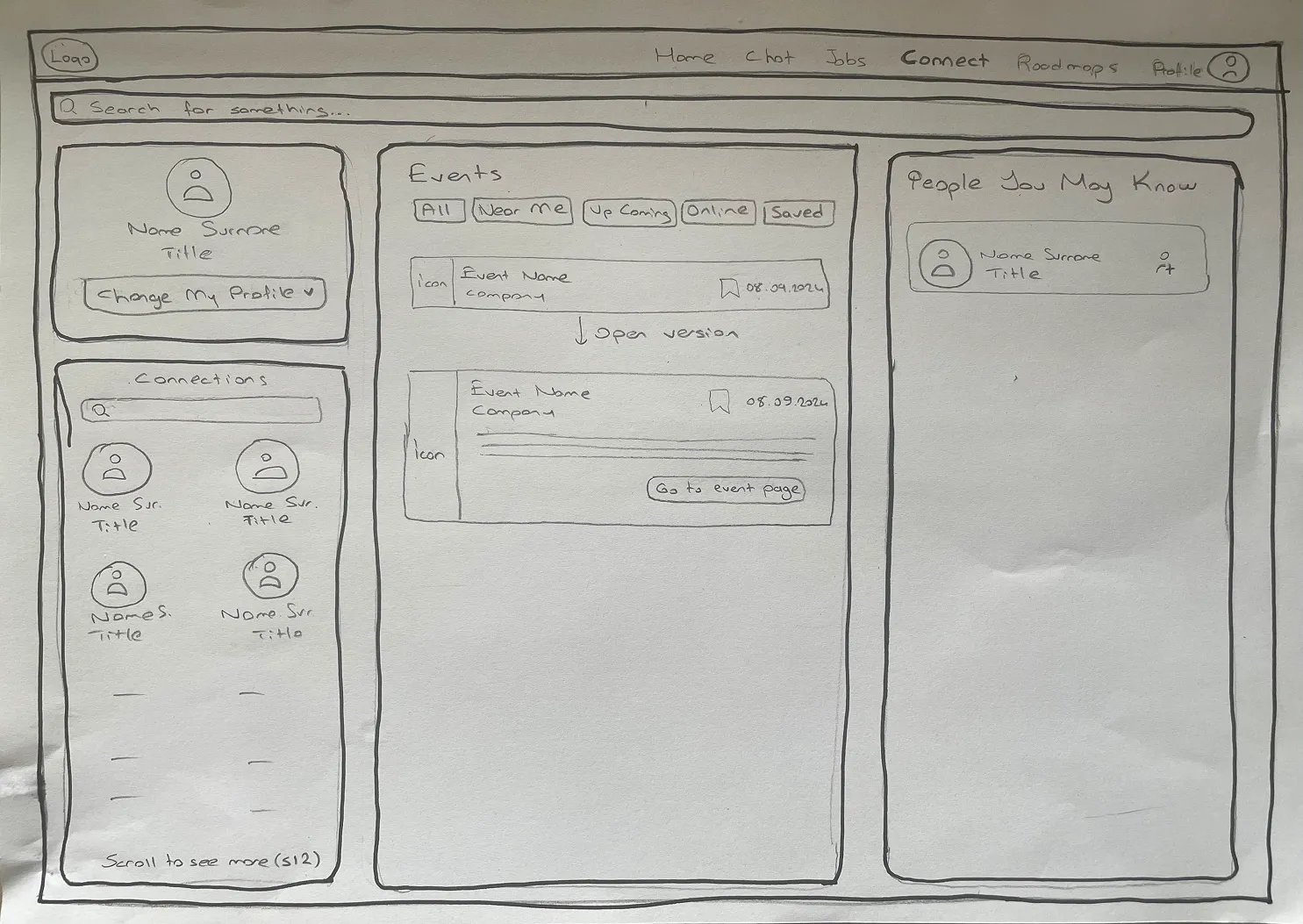
This was the screen that changed most between first sketch and final design. I show that process here because the iteration is part of the story — and because Connect is also where the Chimp Quickchat panel is most clearly visible in context. The AI isn't just behind the roadmap; it's available throughout the product.
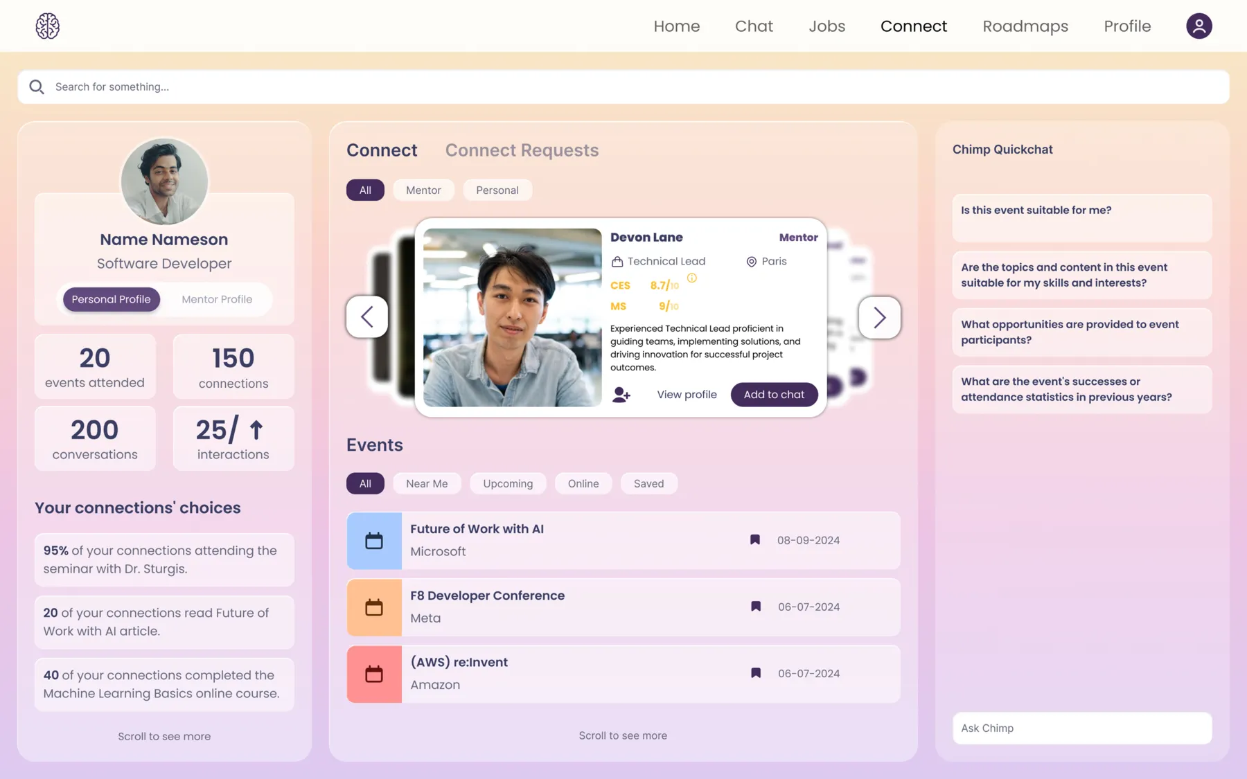
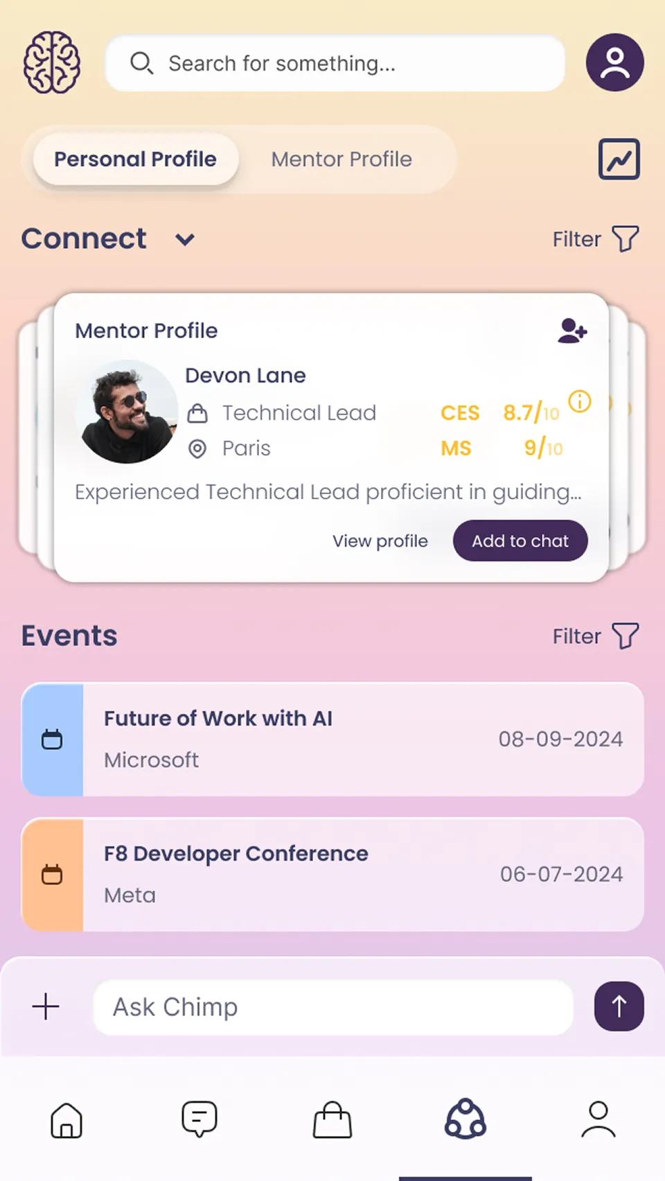
1. Connections list → Your connections' choices
The sketch showed a grid of connection avatars on the bottom left — who you're connected with, nothing more. The final design replaced this with social signal cards: "95% of your connections are attending the seminar with Dr. Sturgis."
A list is passive information. "80% of your connections are going to this event" is a signal — should you be there too? This also reflects what Chimp's AI is actually for: not just surfacing data, but extracting meaning from it. The change made the panel actionable rather than decorative.
2. Events moved to the centre, people joined them
In the sketch, three separate ideas sat in three separate columns — connections on the left, events in the centre, people on the right — with no clear relationship between them. Users had no obvious starting point.
In the final design, the centre became entirely dedicated to discovery: people first, then events. Both serve the same user intent — find someone new, or join something new. Grouping them together means a user can answer "what can I do here?" in a single glance.
3. Professionals / Experts tab split
In the sketch, everyone appeared in the same list. The final design introduced two tabs.
The reason: someone at your level who you might collaborate with is a different kind of connection from someone more experienced who you can learn from. Mixing them in one list blurs both — the user doesn't know who they're looking for. The tab split lets users decide their intent first, then browse accordingly.
Roadmap
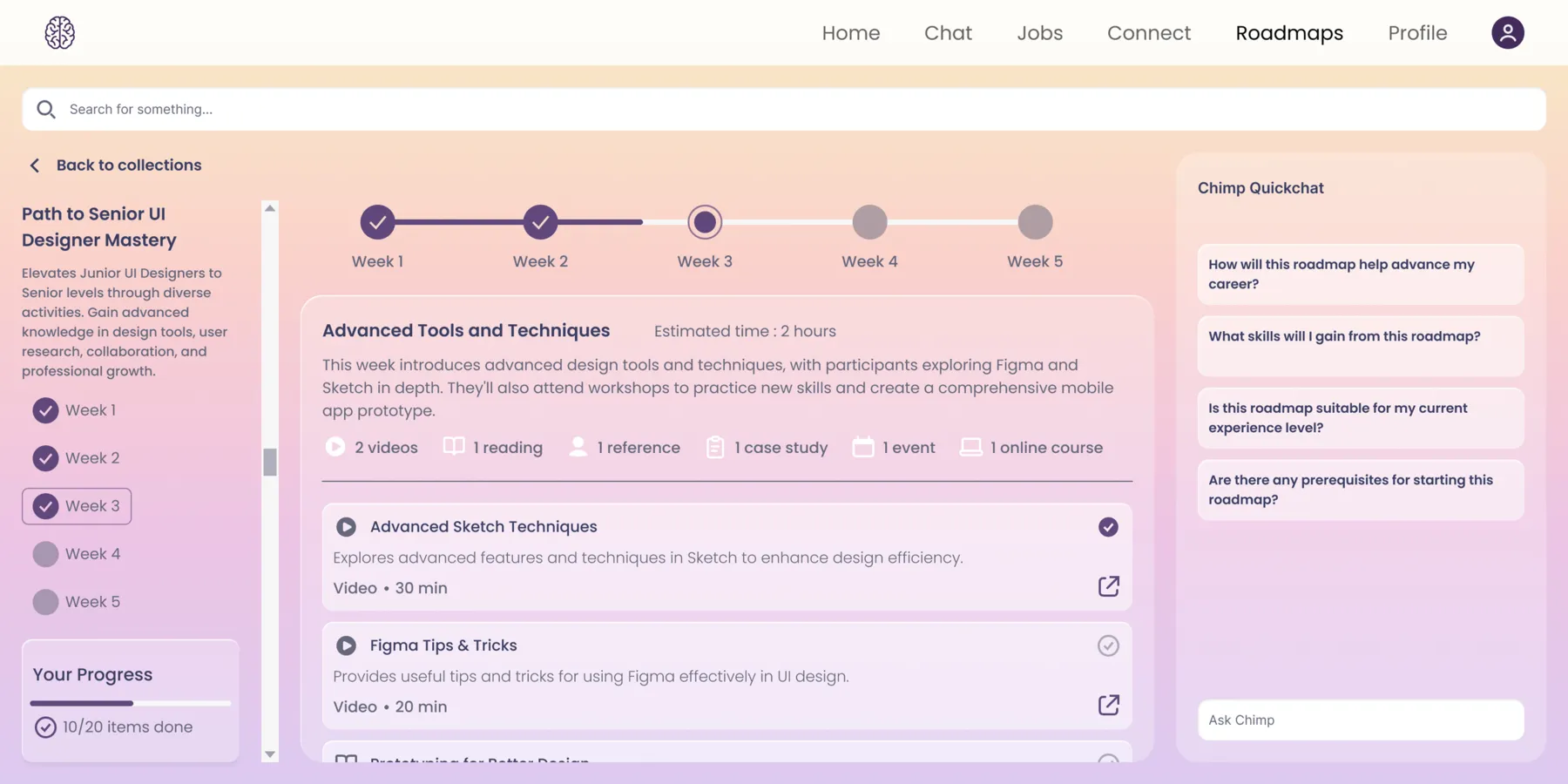
Chimp recommends roadmaps based on your profile — your goals, skills and interests. Each roadmap shows enough information to help you decide whether it's right for you before you commit: the title, a short description, and how long it takes to complete.
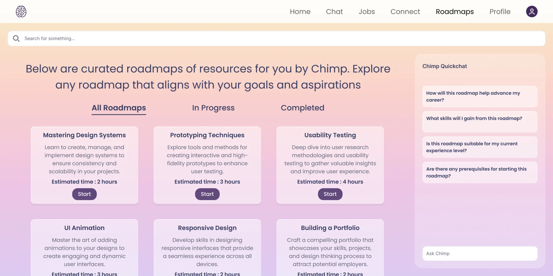
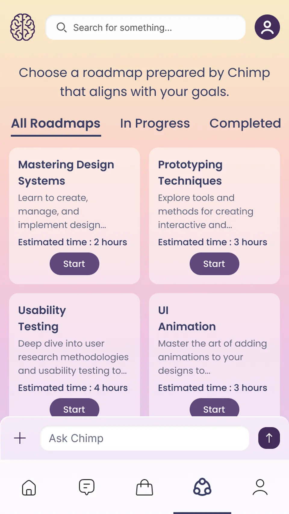
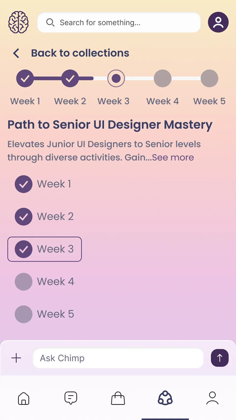
Once inside a roadmap, each week breaks down into specific resources — videos, articles, case studies, online courses — with an estimated time for the week and individual durations for each item. Users can see what they're getting into before they start, pick up something that fits the time they have, and track their progress as they go. Each item links out directly to the content.
Chat
Chimp's AI isn't confined to the roadmap. It's present across the entire product — on web, as a panel on the right side of every screen, surfacing questions relevant to whatever the user is looking at. On the Roadmap it asks about your progress; on Connect it asks about events and people. The context changes, the AI stays.
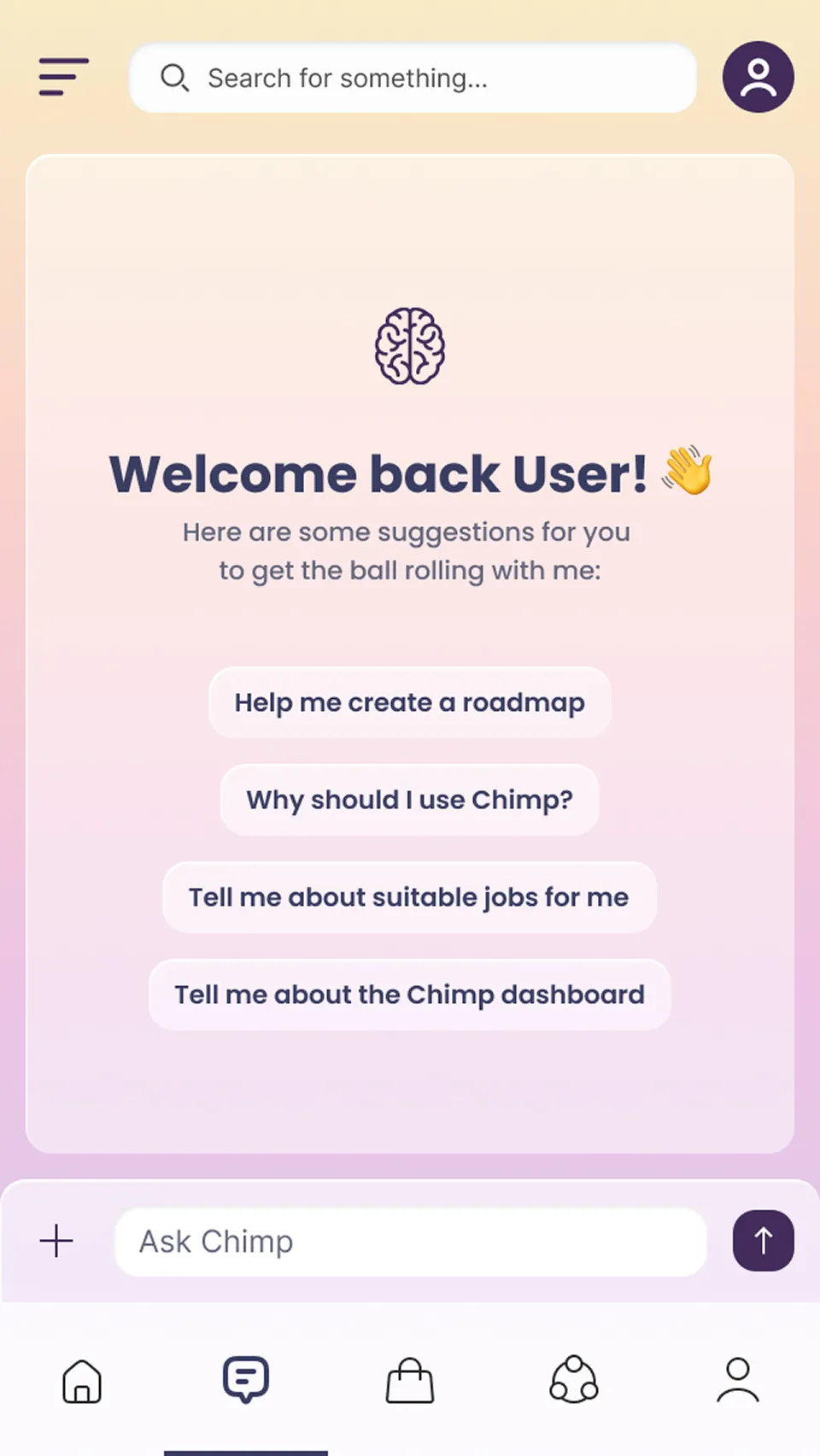
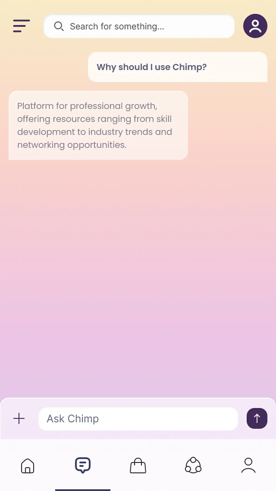
On mobile, it lives as a persistent bar at the bottom of every screen. One tap opens a full conversation — where users can ask anything, upload documents, or pull in content Chimp has already generated for them.
How we worked
04 05
Four people, four months, an MVP to build. The process was lightweight by necessity — but it had a rhythm that held up across every feature.
Brief from the founder
Each feature started with a conversation. The founder described the idea — sometimes in detail, sometimes as a direction — and I'd ask questions until I understood what problem it was solving and for whom. "It would be great if Chimp could give users a roadmap" is a starting point, not a brief. Asking what a user would do with it the first time they opened it turned it into one.
Research
Without users to interview, research was how I grounded decisions. I looked at how comparable products — learning platforms, professional networks, AI assistants — handled the same challenges. Not to copy them, but to understand what conventions already existed and where there was room to do something different.
Sketching before Figma
For complex screens, I worked out structure on paper before opening Figma. It's faster to rearrange columns with a pencil than with frames. The Connect wireframe is the most visible example — the layout decision that mattered most was made before a pixel was placed.
Team review and iteration
Designs were shared with the founder and team before anything moved to development. Most of the changes that matter — the roadmap's before-start state, the Connect layout revision, the profile's treatment of AI-facing fields — came out of these conversations.
What I'd do differently
05 05
Think about usability as much as visual design.
As a first-time designer, I sometimes focused more on how a screen looked than how easy it was to use. On mobile, I moved the Profile Configurations panel behind a small arrow on the side of the screen because it made the main view look cleaner. But it also made a core part of the profile much harder to find — a user who doesn't notice the arrow will struggle to reach it. Looking back, I would have spent more time asking whether users could do what they needed to do, alongside thinking about how the screen looked.
Look at the bigger picture before diving into details.
As a first-time designer working at speed, I often jumped straight into designing a screen without fully thinking through how it connected to the rest of the product. The missing connections list in Connect is a good example — I focused on making the screen cleaner and more useful, but didn't step back to ask whether a user could still do everything they needed to do. Slowing down at the start to map out the full user journey would have caught gaps like this before they made it into the final design.